
Infographic Tips + Best Practices
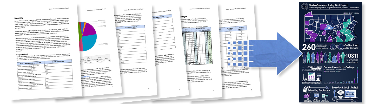
Infographics are a great way of visualizing data from sources like reports, white papers, articles and more in order to make information more readily accessible to a wide audience. Media Commons has been publishing infographics as a companion piece to our Fall and Spring semester reports since 2012 and has distilled some of the thinking behind these in this tutorial to help fast track your own creative process.
Identify Relevant Information
The first step in designing a meaningful infographic is sitting down with your source material and deciding what the key takeaways are that you want to share with your audience. In the case of the Media Commons reports, this would include impact across the university, engagement by campus, interaction with each college, celebration of successful faculty projects, growth of new initiatives, etc.
Comparable Data
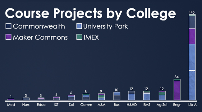
Ensuring that the figures you are comparing are actually evidencing the same thing is important. For instance, at University Park, students might schedule an appointment with a consultant whereas at a Commonwealth location, students use our resources in a first come, first served fashion. Therefore, comparing a project – a collaboration between a consultant and an instructor with a class assignment – makes much more sense since it happens across all of Media Commons.
Organized by Themes
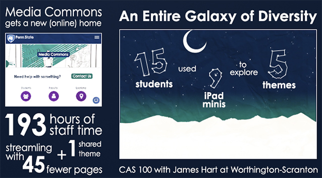
Thinking of your infographic in modular terms will help with keeping it organized for the viewer. As you take a granular look at the types of information you will be presenting, you will also start to notice themes or stories that stand on their own and illustrate distinct facets of your overall documentation. In looking at notable developments from the Spring 2017 semester, subtopics that stood out included the overhaul of our website and the continued usefulness of the Mobile Media Project.
Color Consistency
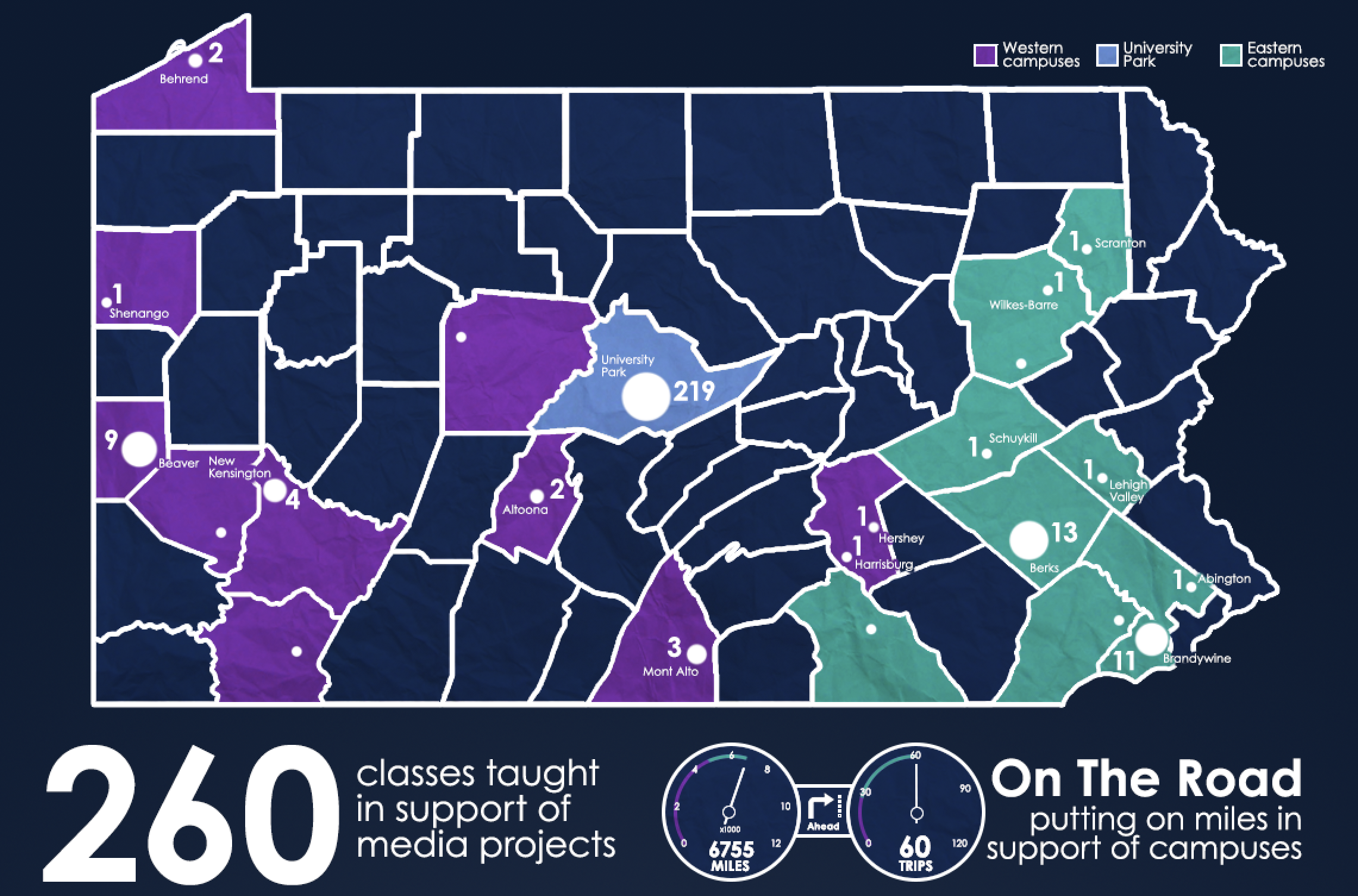
Within an infographic, color need not be just an aesthetic choice: It can subtly guide your viewer’s understanding when used in a consistent fashion. In the case of the Media Commons infographic’s map, we establish that western and eastern Commonwealth campuses have distinct colors and that University Park has its own, as well. We continue referring to these colors to delineate statistics for each traveling consultant.
Illustration Considerations
There is a lot of flexibility in how you actually illustrate your infographic, both stylistically and structurally. Many of these decisions will be dictated by the building tool you choose to use and your own design guidelines, however there are some good rules of thumb for helping to maximize how informational the illustrations are.
Info + graphic

Whenever possible, make sure to connect your illustration to numerical data that you might have access to in your source materials. In this case, eleven projects are displayed as eleven planets and moons.
Clues in Form
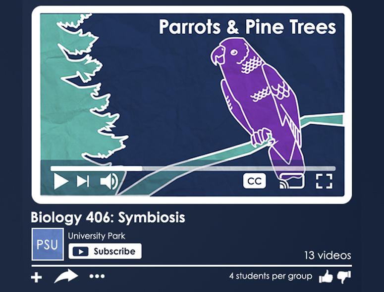
Let the shape of your illustrations help convey information, too. In this example, the YouTube interface frame helps subtly imply that finished projects were uploaded to that streaming service.
Text as Aid
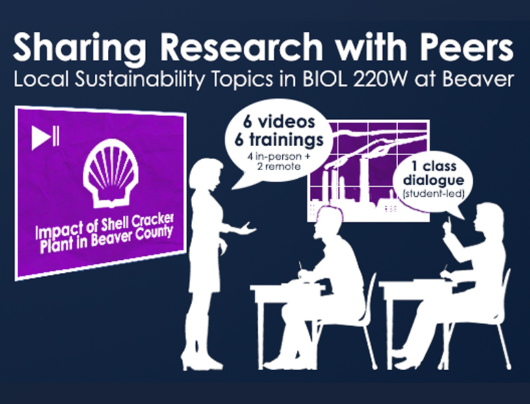
Your infographic should be driven by the illustrations with text in a supporting role. In this example, the concept of a classroom conversation about a local issue is filled in with text specifics.
Don’t Reinvent The Wheel
Not all of your illustrations need to be created from scratch: There are many great resources out there for finding icons, vector drawings and templated creation tools that can help infographic creators of all skill levels. Mix and match resources to customize your infographics while still working quickly.
Free Media Library
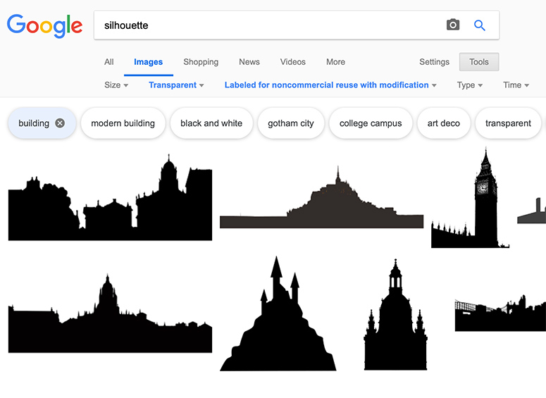
The Free Media Library has many different places to look for images, particularly the Google Creative Commons search, which can be filtered for vector images and only “cost” being cited.
Budget Friendly
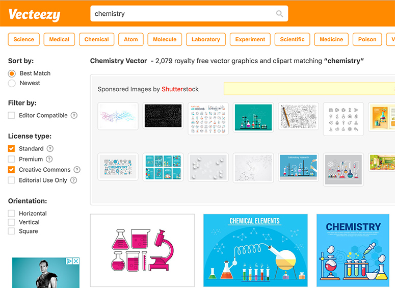
Free sites like Vecteezy allow you to search for vector graphics that can be single images, icon sets or more complex illustrations. Different licensing can apply, so check carefully.
Professional Options
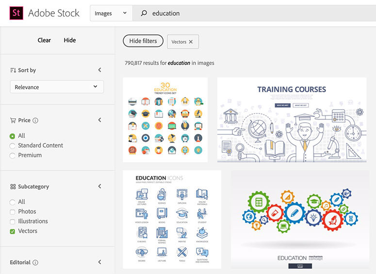
Paid services like Adobe Stock offer graphics and illustrations that have been created by professional artists. Penn State users can contact us for more info on free access to Adobe Stock.